Over the last few years, our team has enhanced Transax in many ways. Some of the most important updates happened behind the scenes, as we upgraded infrastructure and improved system performance. While other changes were more visible, with the Transax Rebrand, a new Transax Mobile App, and a host of new feature releases all along the way.
Our plan has always involved blending in a series of updates into the platform over time. This approach enables us to make positive impacts without disrupting the user experience. By taking these seemingly small steps to introduce improvements, we also make strides in bringing more value to Transax.
The Next Step
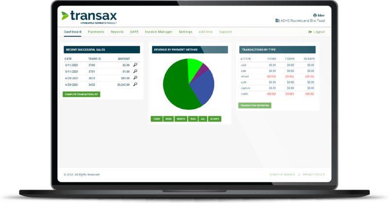
Today we announce the next step in that journey, an improved User Interface (UI) that we hope will provide our Merchant Users with more modern navigation and offer our Agent Users more brand management. Ready for a closer look? Let’s go!
New UI Gives Transax Room to Grow
If you’re a current Transax user, don’t panic! Even though these UI updates are significant to the platform’s progress, the fundamental user experience hasn’t transformed. The core pages stayed the same and your features, functionality, and user permissions remain unchanged.

- Improved Interface – We focused on clearing out the main path of usability in Transax: the navigational interface. We cleaned up the menu options, making it easier for users to navigate more intuitively and freeing up space for us to continue adding new features.
- Application Modernization – We improved essential app code and framework, modernizing the Transax UI structure and streamlining our process for introducing future updates and upgrades into Transax.
- Theme Standards – We developed a new standard that simplifies the way we maintain Agent branding and reduces the time it takes to launch a new theme. Most importantly, it shortens our release cycle as we continue to make UI improvements with more control and predictability.
Improved Navigation For Ease & Efficiency
The majority of Transax UI changes you’ll notice are within your navigation menu. Keep an eye on the top of the page to keep these updates top of mind.

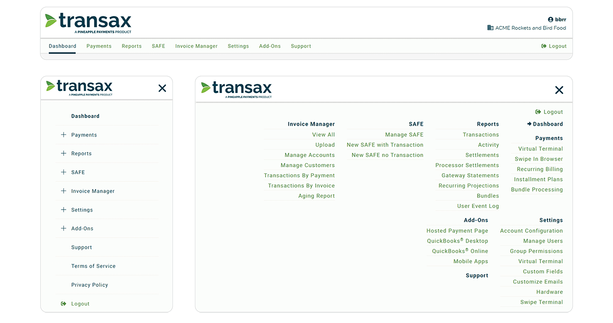
- Responsive Design – We improved the responsive UI with navigation that enables consistent access across any system and adapts to any device. This includes specially formatted Desktop, Panel, and Mobile menus, optimized to the computer, tablet, or mobile device you’re using.
- Modern Navigation – We redesigned the global navigation with a cleaner UI. We changed the color of the top navigation bar, removed icons from the menu, and added a new ‘Logout’ button.
- Reordered & Renamed Menu – We reordered some menu items, sorting by importance with the most commonly used features at the top. We also renamed menu items, removing extra language that cluttered the navigation. For example, “Process Payments” is now just “Payments”. We also removed the word “Report” from each item name in the ‘Reports’ menu.
- Invoice Manager Moved – Previously nestled under “Modules” we moved Invoice Manager to the main navigation. Moving Invoice Manager up a level provides more visibility to this core Transax feature, making it easier to access and see all invoice options from the main menu.
- Modules to Add-Ons – The “Modules” option is now called “Add-Ons”. It’s merely the name that’s changed – your current rates and permissions to access these features remain exactly the same.

